Project Overview
This project is part of the Information Architecture class, where we focus on applying key principles of usability, organization, and design to improve digital experiences. The URecFit website, the central hub for students and staff to access fitness and recreation services, was selected as the subject for redesign due to its potential for improved navigability and user satisfaction.
Group Members
Mikayla Bernetich, Amy Lin, Olaolu Oluwasesan
Content Inventory
The project began with a content inventory, where we analyzed the site’s structure and levels, reviewed data from Google Analytics, and provided notes and recommendations for improvement.
Content Inventory Link
Content Inventory Link
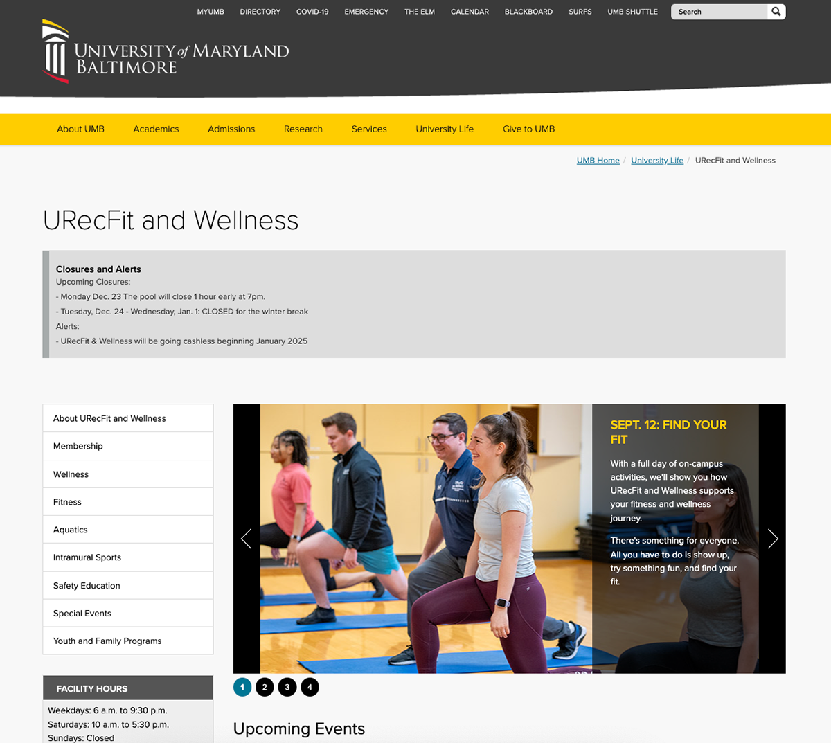
Home
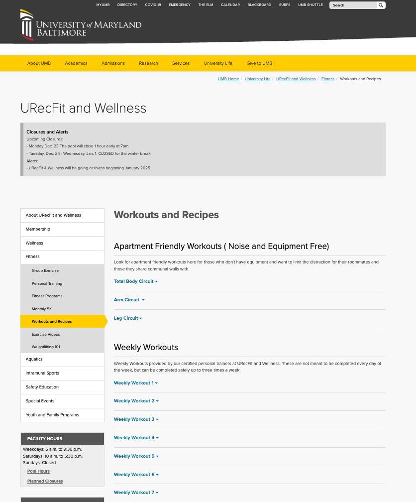
Fitness
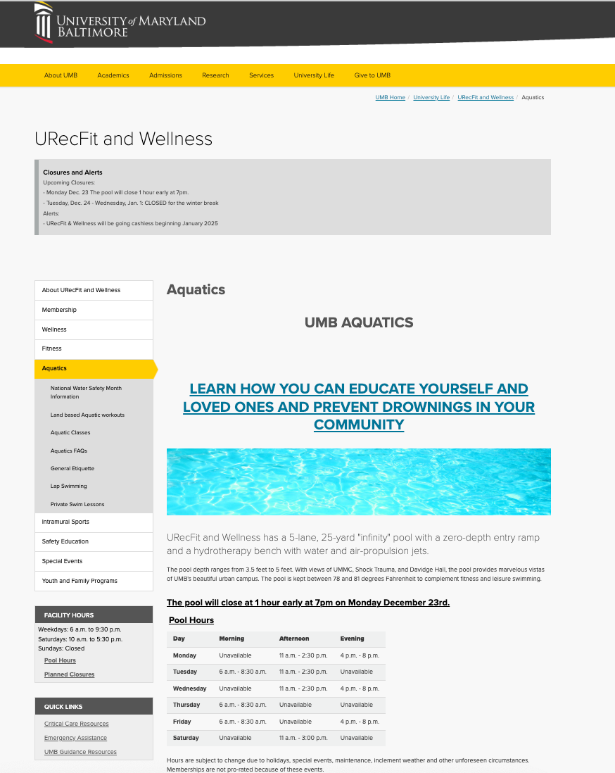
Aquatics
Competitive Analysis
For the competitive analysis, we selected three direct competitors and three indirect competitors and conducted a SWOT analysis to evaluate their strengths, weaknesses, opportunities, and threats. From the analysis, we discovered several key takeaways. Competitors often feature strong visuals and well-organized navigation, areas where our site currently falls short. Many competitors also maintain frequently updated social media channels, providing a level of engagement we could improve upon. Additionally, their websites include interactive components, such as event calendars, to enhance user experience, whereas our site relies heavily on static elements like text and lacks high-quality imagery.
We also identified weaknesses in competitors, such as unclear labeling, which mirrors a challenge on our own site. This finding was reinforced by the results of our card sorting exercise, which highlighted the need for clearer and more intuitive labeling on our site.
View Detailed Report Card Sorting
The card sorting activity used a hybrid method to give participants some freedom while keeping things organized.Participants were first presented with Level 1 pages, where they had the freedom to create, remove, or combine top-level categories as they saw fit. This step offered valuable insights into user-defined groupings and preferences for top-level organization. Following this, Level 2 pages were provided in a random order for participants to place within the established top-level structure, revealing their natural content groupings and how they navigate within predefined categories. Level 3 pages were excluded from this exercise to maintain focus on the higher-level organization
We had a total of 15 participants. The card sorting exercise included a total of 15 participants with a diverse range of ages and backgrounds. The majority of participants were in their 20s (11), with a smaller number in their 30s (3) and 50s (1). Their backgrounds included 2 designers, 5 students, and 4 individuals who spoke English as a second language
We had a total of 15 participants. The card sorting exercise included a total of 15 participants with a diverse range of ages and backgrounds. The majority of participants were in their 20s (11), with a smaller number in their 30s (3) and 50s (1). Their backgrounds included 2 designers, 5 students, and 4 individuals who spoke English as a second language
Key Findings
100% of participants (15 out of 15) consistently grouped the terms “Aquatic Classes,” “Lap Swimming,” “Land-Based Aquatic Workouts,” and “Aquatic FAQs” under the category Aquatic.
60% of participants (9 out of 15) asked for clarification about “Poe Cup”, indicating a lack of familiarity with the term.
47% of participants (7 out of 15) categorized the term “National Water Safety Month” under “Safety Education,” 33% (5 out of 15) placed it under “Aquatics,” and 20% (3 out of 15) placed it under “Special Events.”
Interesting Findings
One participant placed “Monthly 5K” under “Membership” instead of “Special Events” because she misunderstood it as the cost of the membership rather than an event.
Updated Site Map
Based on the results of the card sorting exercise, we revised our sitemap to align with user feedback and improve navigation. Below are the some updates made:
• Renamed “Poe Cup” to “Intramural Contest: Poe Cup” to clarify that “Poe Cup” is a sports contest
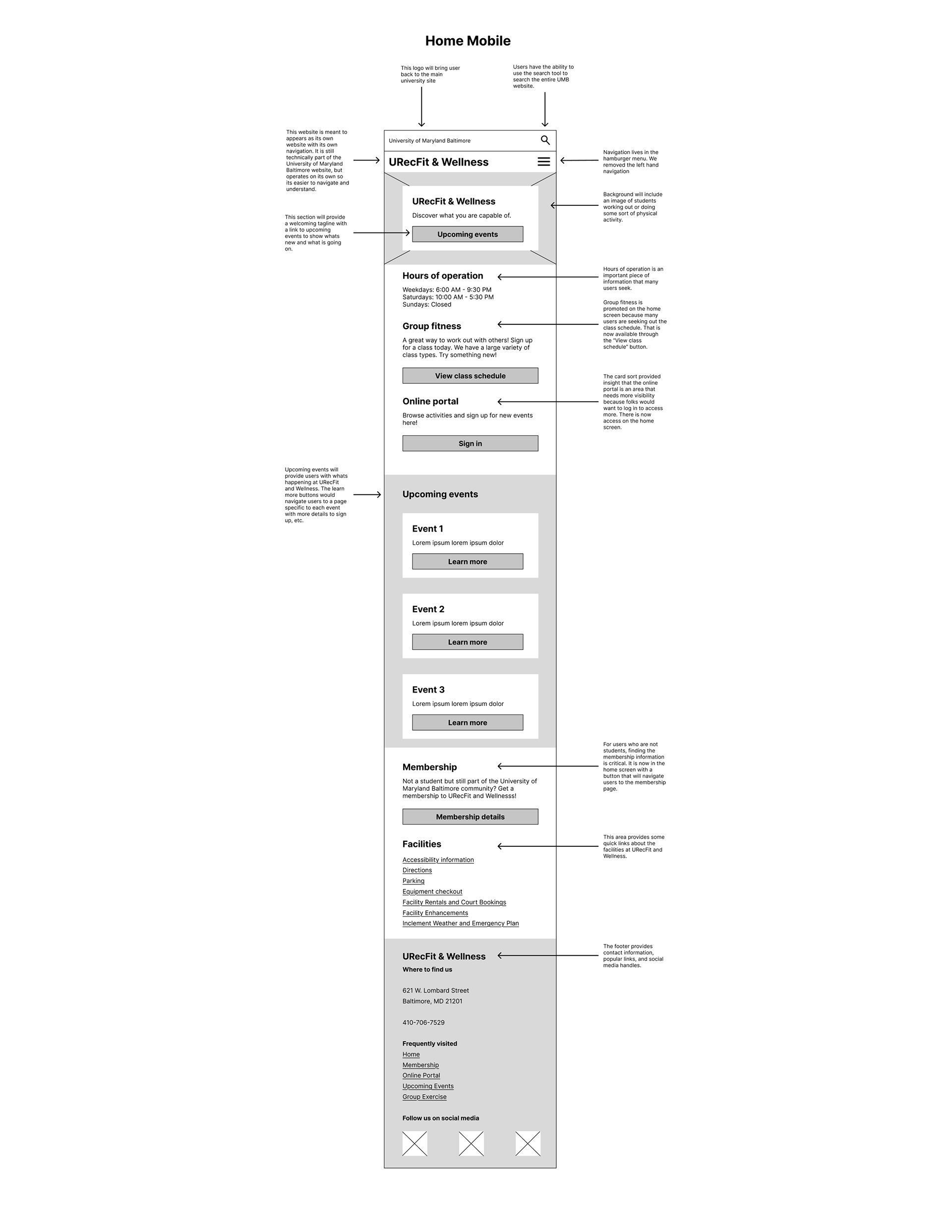
• Moved “Online Portal” to the Top-Level Navigation so it ensures easier access for users.
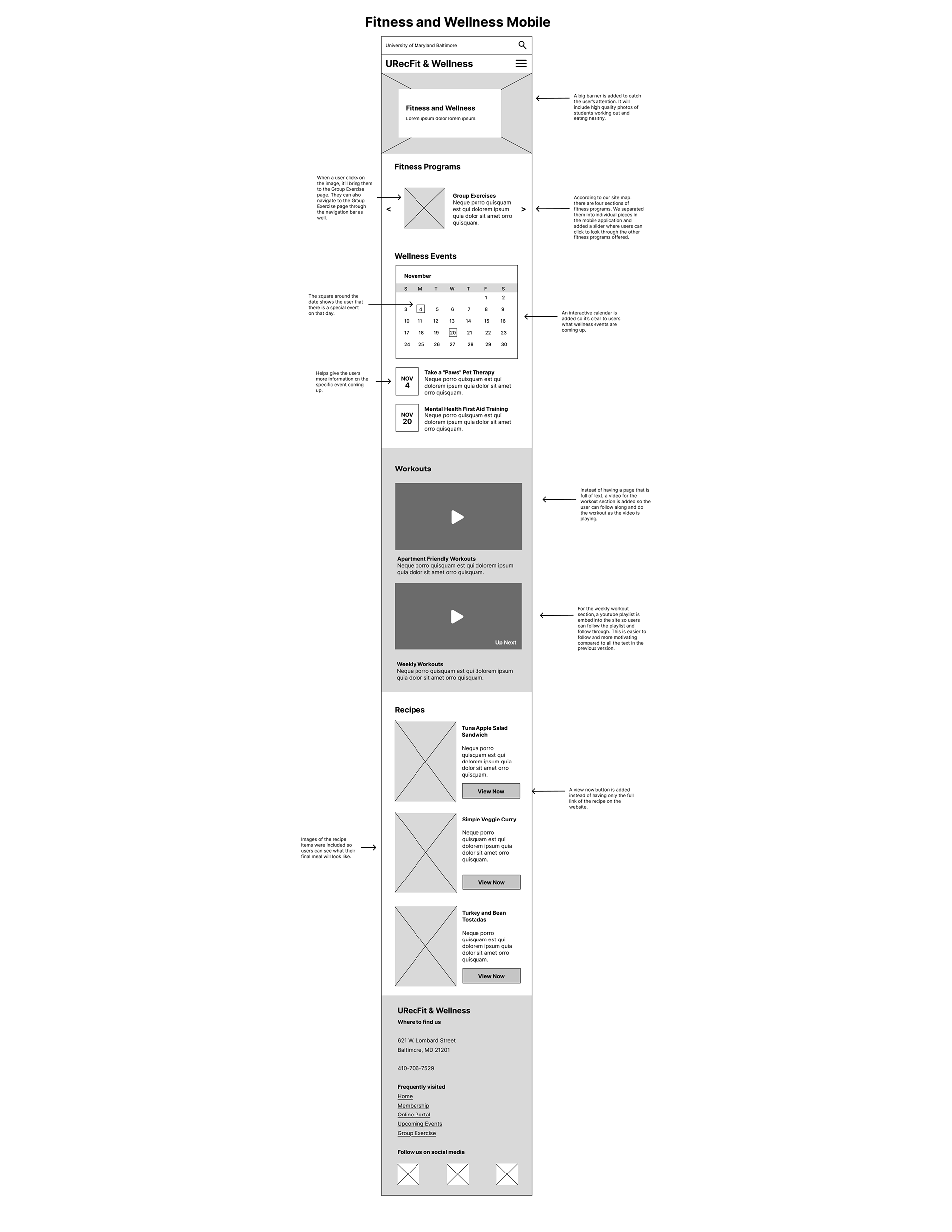
• Combined “Fitness” and “Wellness” into One Category to reflect user preferences for a simplified and unified structure.
• Shortened “About URecFit & Wellness” to “About Us” for better readability and consistency.
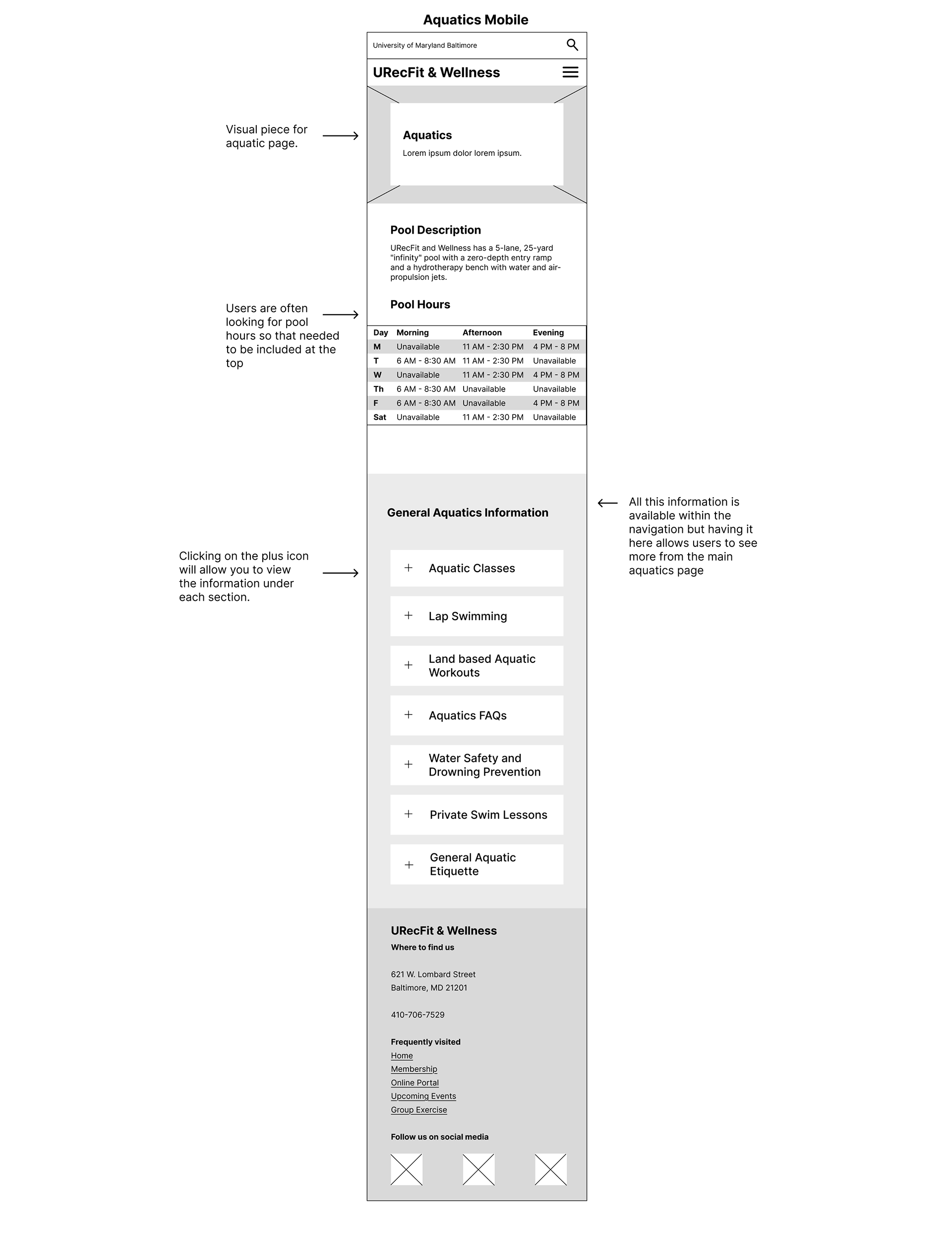
• Renamed “National Water Safety Month” to “Water Safety and Drowning Prevention” to better aligns with the content
and purpose of the webpage.
Wireframes
The wireframes we created focused on reducing cognitive load and enhancing user interaction by improving navigation and overall usability. To achieve this, we removed the University of Maryland Baltimore navigation, which helped reduce visual clutter and create a more focused interface. We implemented a streamlined, URecFit-specific top-level menu, complemented by a mega menu for subpages, making navigation paths simpler and more efficient. Visual aids and video content were incorporated where appropriate to enhance the user interface and provide engaging, easily digestible information. These changes aim to improve clarity and organization, resulting in a more intuitive and user-friendly experience.
Visual Design
After completing the class, which ended with designing wireframes, I found myself inspired to take the project further. I thought it would be both fun and beneficial for my portfolio to develop a fuller, more polished version of the design. Using the wireframes as a foundation, I expanded the concept by adding visual elements to bring the design to life.
